Taught by Patrick Hebron at ITP, Fall 2015
Getting Started with Plotting in Python and Matplotlib
Documentation:
Importing Numpy library:
import numpy as npImporting Pyplot library:
import matplotlib.pyplot as pltPlot y-axis data:
# Note: x-axis is automatically generated as [ 0, 1, 2, 3 ]

plt.plot( [ 1, 4, 9, 16 ] )
plt.show()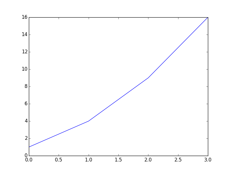
Plot x-axis and y-axis data:
plt.plot( [ 1, 2, 3, 4 ], [ 1, 4, 9, 16 ] )
plt.show()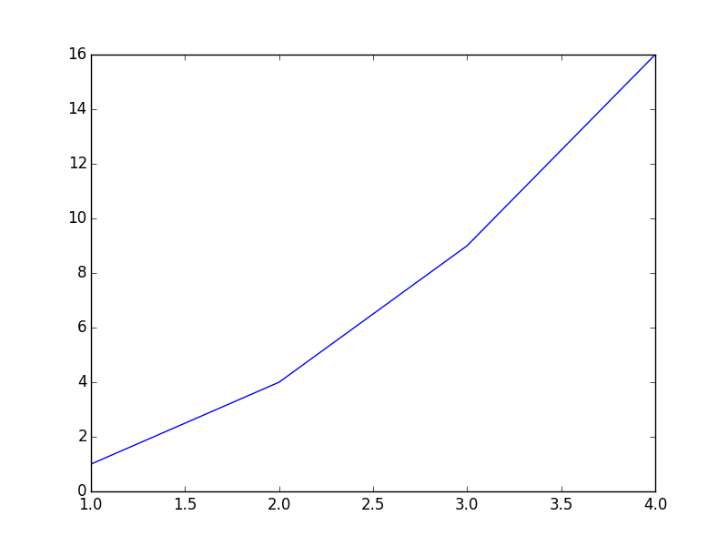
Plot x-axis and y-axis data with per-axis extents:
# Note: axis() formatted as [ xmin, xmax, ymin, ymax ]

plt.axis( [ 0, 6, 0, 50 ] )
plt.plot( [ 1, 2, 3, 4 ], [ 1, 4, 9, 16 ] )
plt.show()
Customize axis labels:
plt.xlabel('X-AXIS DATA')
plt.ylabel('Y-AXIS DATA')
plt.plot( [ 1, 2, 3, 4 ], [ 1, 4, 9, 16 ] )
plt.show()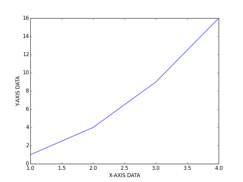
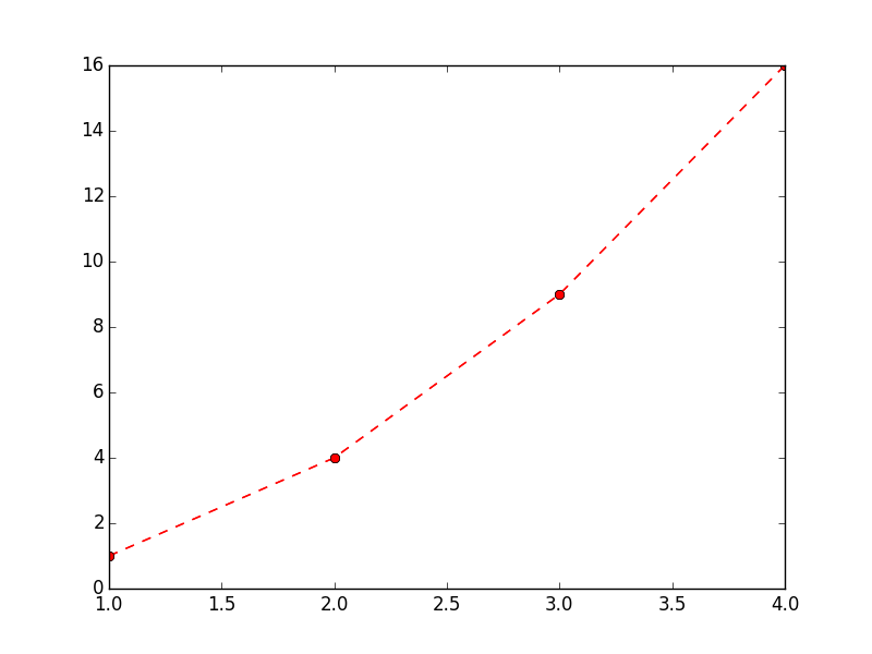
Customize plot stylization:
plt.plot( [ 1, 2, 3, 4 ], [ 1, 4, 9, 16 ], 'ro--')
plt.show()
Additional documentation of stylization options can be found here: Pyplot Lines and Markers and Pyplot Line Properties
Plot functions:
def sigmoid(x):
    return 1.0 / ( 1.0 + np.exp( -x ) )

def dsigmoid(x):
    y = sigmoid( x )
    return y * ( 1.0 - y )

def tanh(x):
    return np.sinh( x ) / np.cosh( x )

def dtanh(x):
    return 1.0 - np.square( tanh( x ) )

xData = np.arange( -10.0, 10.0, 0.1 )
ySigm = sigmoid( xData )
ySigd = dsigmoid( xData )
yTanh = tanh( xData )
yTand = dtanh( xData )

plt.axis( [ -10.0, 10.0, -1.1, 1.1 ] )
plt.plot( xData, ySigm, 'r', xData, ySigd, 'r--' )
plt.plot( xData, yTanh, 'g', xData, yTand, 'g--' )
plt.show() 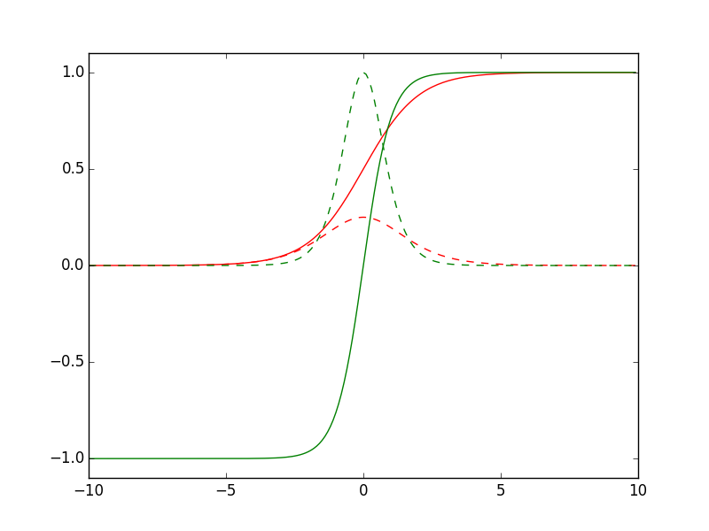
Working with multiple figures and axes:
def f(t):
    return np.exp(-t) * np.cos(2*np.pi*t)

t1 = np.arange(0.0, 5.0, 0.1)
t2 = np.arange(0.0, 5.0, 0.02)

plt.figure(1)
plt.subplot(211)
plt.plot(t1, f(t1), 'bo', t2, f(t2), 'k')

plt.subplot(212)
plt.plot(t2, np.cos(2*np.pi*t2), 'r--')
plt.show()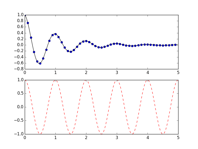
Working with text:
mu, sigma = 100, 15
x = mu + sigma * np.random.randn(10000)

# the histogram of the data
n, bins, patches = plt.hist(x, 50, normed=1, facecolor='g', alpha=0.75)

plt.xlabel('Smarts')
plt.ylabel('Probability')
plt.title('Histogram of IQ')
plt.text(60, .025, r'$\mu=100,\ \sigma=15$')
plt.axis([40, 160, 0, 0.03])
plt.grid(True)
plt.show()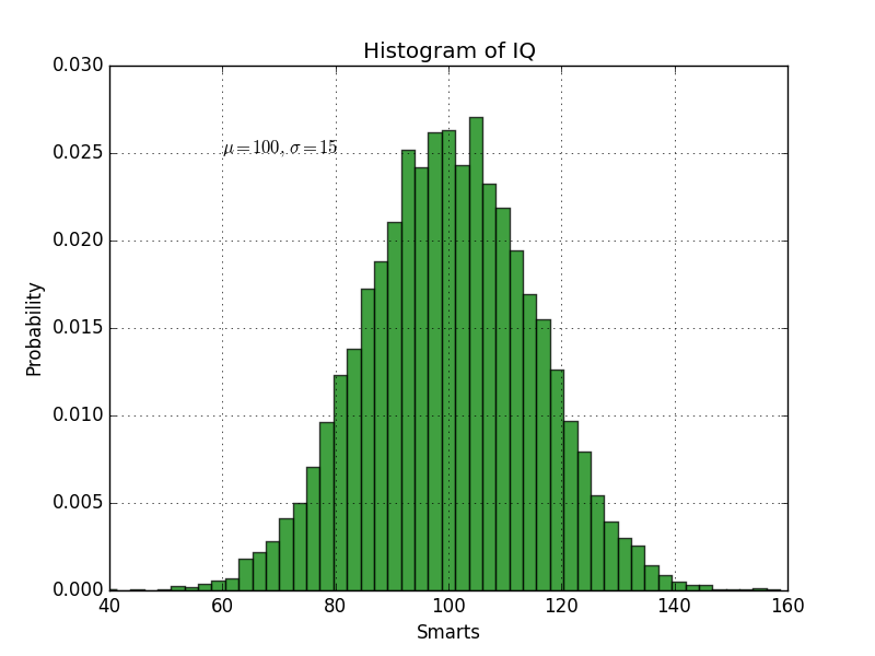
ax = plt.subplot(111)

t = np.arange(0.0, 5.0, 0.01)
s = np.cos(2*np.pi*t)
line, = plt.plot(t, s, lw=2)

plt.annotate('local max', xy=(2, 1), xytext=(3, 1.5),
            arrowprops=dict(facecolor='black', shrink=0.05),
            )

plt.ylim(-2,2)
plt.show()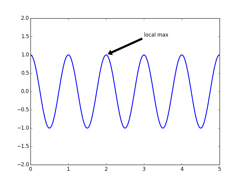
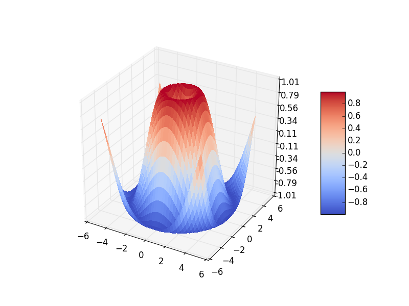
Plotting in 3D:
from mpl_toolkits.mplot3d import Axes3D
from matplotlib import cm
from matplotlib.ticker import LinearLocator, FormatStrFormatter

fig = plt.figure()
ax = fig.gca(projection='3d')
X = np.arange(-5, 5, 0.25)
Y = np.arange(-5, 5, 0.25)
X, Y = np.meshgrid(X, Y)
R = np.sqrt(X**2 + Y**2)
Z = np.sin(R)
surf = ax.plot_surface(X, Y, Z, rstride=1, cstride=1, cmap=cm.coolwarm,
                       linewidth=0, antialiased=False)
ax.set_zlim(-1.01, 1.01)

ax.zaxis.set_major_locator(LinearLocator(10))
ax.zaxis.set_major_formatter(FormatStrFormatter('%.02f'))

fig.colorbar(surf, shrink=0.5, aspect=5)

plt.show()